The Power of Data Visualization- An Evaluator's Experience
How IEG learned that "less is more" when presenting our data for maximum impact.
How IEG learned that "less is more" when presenting our data for maximum impact.
By: Brenda BarbourWorking with Stephanie helped us rethink how we presented our data and, in the process, we learned a thing or two about how seemingly simple design choices could make a powerful impact.
IEG maintains one of the most comprehensive data sets on World Bank performance - with project ratings dating back to the 1970s. Not surprisingly, we get a lot of requests for this information. Several years ago, we created a comprehensive data dashboard - yes, with visualizations - to try to make this data efficiently available to all.
But even with the dashboard, the questions kept coming.
Although we have staff who use Tableau regularly in their evaluation work, we realized there was something more we needed. I turned to Stephanie Evergreen, a data presentation heavy hitter, to see how we could make our data page more useful.
Working with Stephanie helped us rethink how we presented our data and, in the process, we learned a thing or two about how seemingly simple design choices could make a powerful impact. In this blog, we walk you through the changes we made.

Our old dashboard (shown above) featured eight categories that tracked the different outcomes that we used to track the World Bank Group’s performance. You can see them in the legend on the right. They are also represented in the stacked column chart across the bottom of the dashboard, which had too many stacks to make sense even with a diverging color scheme. Plus, as stacked columns, the value labels didn’t fit inside the available space very well. The same categorization was also showing up in the pie charts, with wedges so tiny it was difficult to get useful information. The pies were also sized according to the number of projects occurring there, and these sizes were explained in a separate legend that required a lot of work on the part of the viewer to make accurate estimations.
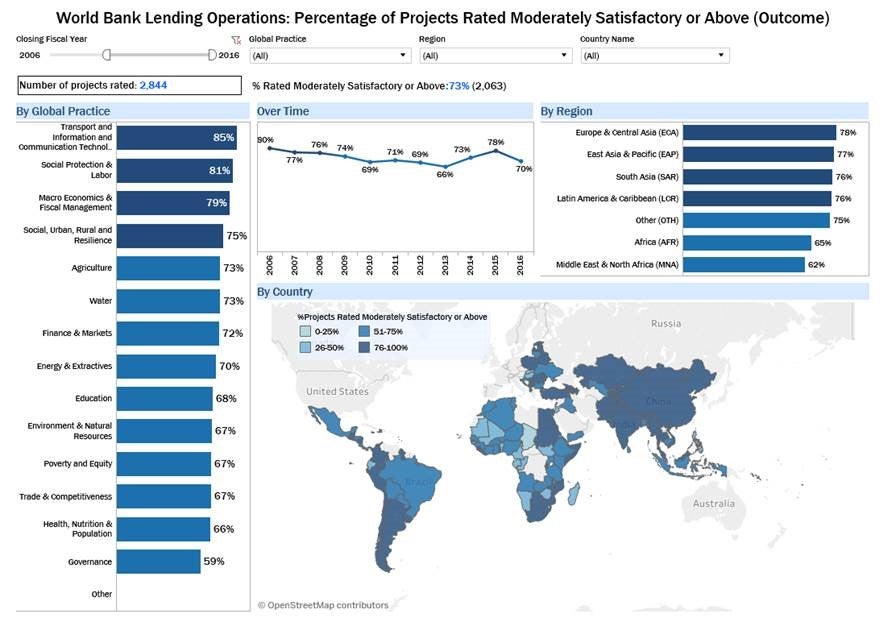
Together with Stephanie, we started our revision process started with a discussion of what the user really wants to know. Stephanie helped us see that while we had had a lot of available data, it led us to create visuals with too much detail. Detail overload. We decided to start with what the typical World Bank user, our primary audience, would want to know. We took the standard outcome ratings that we apply when assessing World Bank projects and created a much simpler visual reflecting that data. This move immediately eliminated the crazy stacked bars and pie charts. We were then able to tell more detailed stories about the percent of projects that were rated satisfactory, using a 4-shade blue scale, located in the middle of the dashboard, that serves all visuals.
The original dashboard also asked users to first pick a region and then to choose a country – but wait, where? There are two places labeled “Step 2” on the dashboard. Either would work, but choices can create confusion. So, we removed the filters from the visualization area and re-positioned them across the top of the dashboard, letting users select content most relevant to them.
Finally, to let users see more at one time, we rotated columns to bar charts and expanded the space for the map. The results – we have a cleaner, clearer dashboard display with an improved flow to help users get what they want, quickly – whatever their wants might be. (IEG's new data page is shown below).

So what were the key insights from this makeover?
First, don’t be afraid to hire an expert, even for things that you can technically do. Even though many staff on the team are Tableau experts, Stephanie’s unique view on how user’s process data made us radically change our approach.
Second, less is usually more. I have always known this adage but hadn’t thought to apply it to our data page. Even though we have ratings data back to the 1970’s, most users are looking for data from the past 20 years. Choosing to present the data from 2000 onward allowed us to simplify the page and probably increase response times.
Finally, the dashboard doesn’t have to do everything for everybody. There are surely some people who want every rating for every project as far back as we can go. But MOST users want to know how well are Bank projects performing. In my region? My sector? For those who want everything on everything, we can get them that, but the dashboard is designed to meet the needs of everybody else.
Please let us know what you think of the improved dashboard, and tell us how you’ve used visualization to communicate your evaluation data. We are currently working on further improvements to the dashboard and look forward to sharing them in the coming months. We’d love to see how others are applying data visualization to their work.

Interested in learning more about how to improve your data presentation? Check out Stephanie’s books, Presenting Data Effectively and Effective Data Visualization. Learn more about Stephanie and her work.

Comments
thank you for sharing the…
thank you for sharing the knowledge! I like the new dashboard.
Thanks for emphasizing the…
Thanks for emphasizing the importance of visualizing data and make it accessible.
A consideration for the next phase: make it mobile phone-friendly. Three quarters of global internet traffic takes place via smartphones but this dashboard is not operational with small screens.
I guess IEG focuses on their…
I guess IEG focuses on their primary user - World Bank professional, who is most likely to use the dashboard from a desktop computer. Having worked in a several website updates it can take quite a bit of time to have data visualizations mobile device friendly for a relatively limited return. For me it would paramount to see who uses the data and for what; if almost all traffic comes corporately and the data is used for project documents, then there is no real need in investing resources into change. However, I agree with another reader that making it accessible to low bandwidth connections is a priority.
Thank you for sharing this…
Thank you for sharing this experience and the practical steps taken! It's very helpful to see the before and after of the dashboard.
I agree with the other…
I agree with the other comments. This is a very nice data viz approach/strategy as well as being useful and informative. I think being able to access it other formats (even PDF versions for some mobile users) will help accessibility of the work and also to inform lower or more constrained resource (less tech, less reliable power etc.) environments. One idea I am looking at is how data viz can inform scenarios where we have limited clinical/epidemiological data, for example. Visualization can help inform our questions just as much as our answers.
Wow, thanks for this…
Wow, thanks for this improvement in your ways to communicate through data visualization. I have liked the idea and I appreciate the team behind this.
Add new comment