
Leveraging Imagery Data in Evaluations
Chapter 2 | Methodology
Given the limited availability of suitable data from traditional data sources, the current analysis required highly customized data collection and methodologies that relied heavily on daylight imagery data (both satellite imagery and streetscape digital photos). We also used ancillary data sources, such as data on points of interest, road networks, and interview records, to complement these data.
Our analysis applied two innovative methods. Subsequent sections of the paper elaborate on the theoretical foundations and the practical implementation details of both methods.
- Method 1: Supervised classification of optical satellite images to determine the evolution over time of the composition of land use/land cover classes. The analysis was based on training a machine-learning algorithm to classify individual pixels of satellite images across four classes:1 built-up environment, forest, water, and agricultural land.
- Method 2: Semantic segmentation of digital photos of urban scenes. This technique—an application of deep learning and convolutional neural networks—aims to label each pixel in an image with the corresponding class of what is being represented (for example, sky, roads, or buildings). These features can then be geocoded, plotted in maps, and used to quantify the urban appearance of a city or area across multiple dimensions.
Method 1: Multispectral Supervised Classification of Optical Satellite Imagery to Derive Land Use/Land Cover Classes
Although the terms land use and land cover are often used interchangeably, each has a precise meaning, and the two are typically estimated using different data sources and different methodologies. Land use refers to land’s economic use (such as residential areas, agriculture, and parks), and land cover refers to physical cover on the ground (such as bare soil, crops, and water). For example, a built-up area (land cover) can be used in diverse ways, such as for residential, manufacturing, or cultural purposes (land use). When used jointly, land use/land cover refers to the categorization of human activities and natural elements of a landscape within a specific time frame and based on an established methodology (Sabins and Ellis 2020).
Several approaches exist for modeling land use/land cover changes, including manual, numerical, and digital approaches. Land use/land cover modeling is not new, with examples dating from the early 1970s (Brown et al. 2012). Recently, however, machine learning has contributed new methodological advances to greatly aid in the modeling task.
Several readily available models also include land use/land cover classes. One widely used land use/land cover model—moderate-resolution imaging spectroradiometer land cover type (MCD12Q1)2 —derives global land cover types at yearly intervals (2001–20) from satellite data. These existing models, however, typically have only moderate spatial resolution (approximately 500 meters in the case of the moderate-resolution imaging spectroradiometer), which makes them more suitable for larger areas of analysis.
Consequently, as it was not possible to use existing models, our analysis derived land use/land cover classes using a pixel-based classification approach in which each pixel in an image is classified as belonging to one land use/land cover class (our analysis used four such classes: built-up environment, forest, water, and agricultural land). Broadly, there are two approaches to performing this classification: unsupervised and supervised. Unsupervised classification considers only the data and focuses on identifying common patterns in images. In supervised classification, a training set of specific pixels that are known to belong to each of the classes is first developed; then, a classification model is trained, based on this sample data, to recognize and categorize pixels over the same classes but over a much larger area. Supervised classification is generally the preferred approach when there are sufficient data to build the needed training set. Our analysis relied on supervised classification approaches.
Data Source: Optical Satellite Imagery
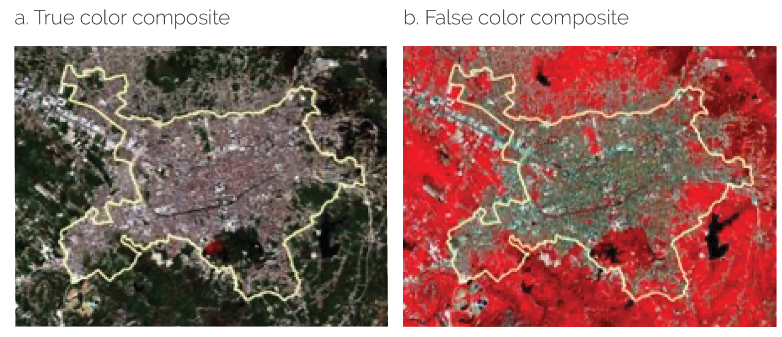
Our analysis used as its primary data source optical satellite imagery: images of the Earth captured by imaging satellites operated by space agencies and private corporations. Although satellite images are often displayed as photos, these two visual presentations involve very different data types. Satellite images capture data beyond the visible range of the electromagnetic spectrum and store this information in spectral bands, each capturing a specific section of the spectrum.3 The most common photo representation of a satellite image, a true color composite, combines the red, green, and blue color bands to produce the closest possible photographic representation of a satellite image. This image is just a representation, however, and captures only a fraction of the data the satellite image contains.
For classification purposes, it is customary to combine different bands because they can reveal different patterns in the data. For example, a false color composite combining the infrared band and the red and green bands (as illustrated in figure 2.1) makes vegetation easier to detect because it is displayed in a distinctive red color.
Figure 2.1. Color Composites for Highlighting Data

Figure 2.1. Color Composites for Highlighting Data
Source: Copernicus program, European Space Agency.
Note: Panel a shows a true color composite (red, green, and blue bands within the visual band); panel b shows a false color composite (infrared band and red and green bands within the visual band) of the city of Tirana, Albania, May 5, 2021, as captured by Sentinel-2, an Earth observation mission from the European Space Agency’s Copernicus program.
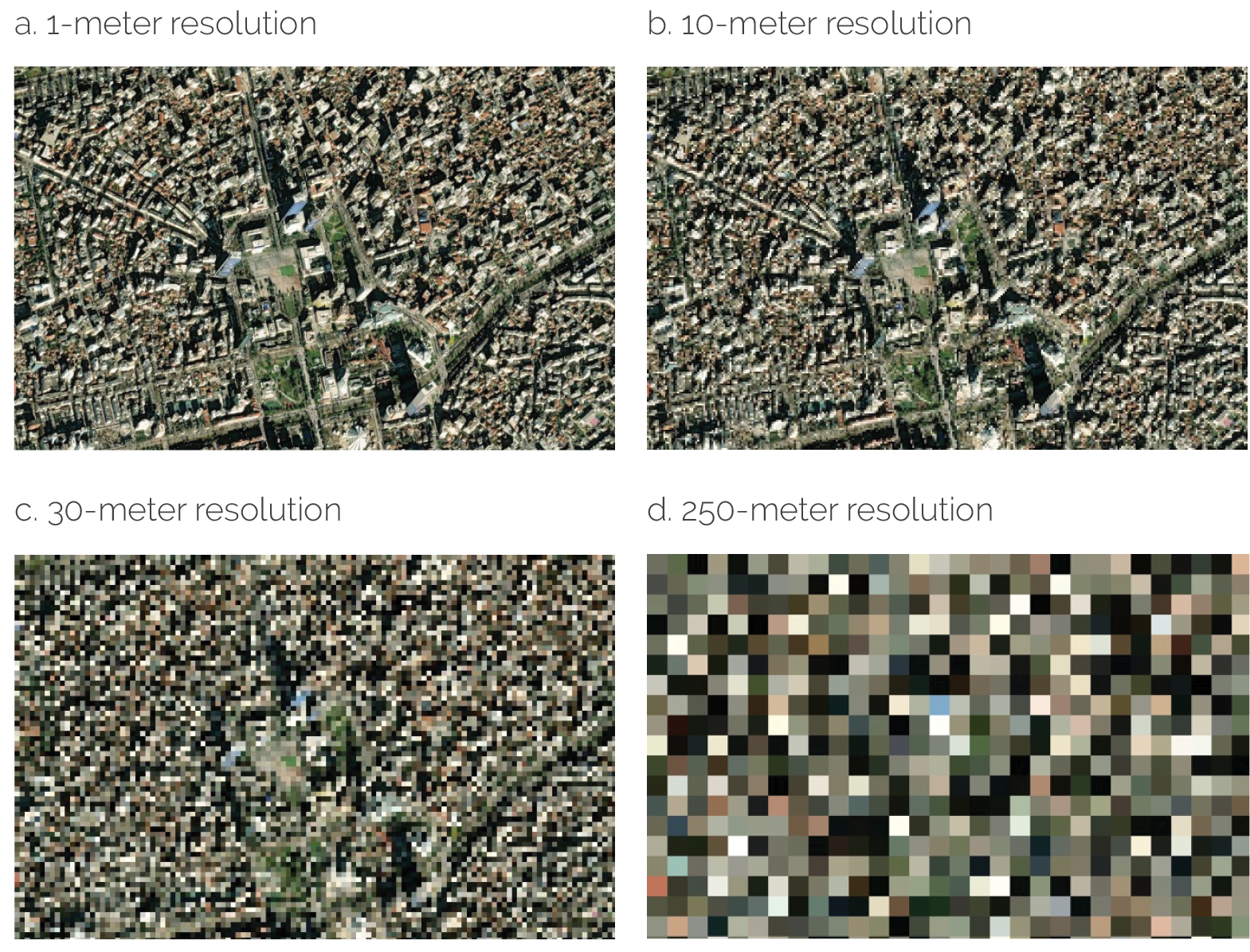
Another important concept is spatial resolution, which refers, broadly, to the corresponding size, on the ground, of one pixel in a satellite image. Pixels are square and defined by a single number representing their ground dimensions. For example, each pixel in a satellite image with a 10-meter resolution covers an area of 10 × 10 meters on the ground. Spatial resolution for satellite images typically ranges from a few hundred meters to just a few centimeters. Each unit increase in an image’s resolution increases the amount of critical information contained in each pixel exponentially. In other words, images with a large pixel size have low spatial resolution and do not allow much visual detail to be displayed. Contrarily, images with a small pixel size have high spatial resolution and allow more visual details to be observed. Figure 2.2 illustrates different levels of spatial resolution.
Figure 2.2. Comparison of Different Levels of Spatial Resolution for the Same Area

Figure 2.2. Comparison of Different Levels of Spatial Resolution for the Same Area
Source: NOAA Data Access Viewer (Open Access).
Note: The images shown of Tirana city center display different levels of spatial resolution.
Our analysis used imagery from Landsat 7,4 an Earth-observing satellite from the National Aeronautics and Space Administration that was launched in 1999 and remained in orbit until April 2022. Landsat 7 imagery provides a continuous time series of data that overlaps with the study period. Landsat 7 images encompass eight spectral bands, with a spatial resolution of 30 meters for bands 1 to 7 (blue, green, red, near infrared, shortwave infrared, and thermal) and 15 meters for band 8 (panchromatic).
Methodological Considerations
Data selection. We selected images for the area under analysis for each year in the period 1999–2010 to enable us to observe the evolution of land use/land cover classes over time.
Data processing. Before the analysis, we subjected the images we selected to atmospheric correction, which removes the absorption and scattering effects of the atmosphere on the reflectance values of optical remote-sensing imagery. In addition, we applied panchromatic sharpening (pansharpening) to 30-meter images to transform them into images with 15-meter spatial resolution (Choi, Park, and Seo 2019). Pansharpening, an image fusion technique, creates a color image with enhanced visual detail by merging an image’s multispectral bands, which offer high spectral resolution but lower spatial resolution, with the panchromatic (black-and-white) band, which provides high spatial resolution but lower spectral resolution. Essentially, pansharpening employs mathematical algorithms to generate a single image that has both high spatial and high spectral resolution.
Training and validation sets. We generated training and validation data by visually inspecting the texture of the images. We used 80 percent of the total pixels in the images for each year as training data for model development, reserving the remaining 20 percent for use as a validation set to evaluate the model’s accuracy.
Classification. Machine learning, a subset of artificial intelligence, encompasses a set of algorithms that can automatically learn from data without being explicitly programmed. We used five machine-learning algorithms—random forest, support vector machine, gradient-boosted decision tree, naive Bayes, and classification and regression tree—for image classification. Random forest, an ensemble learning algorithm, combines the outputs of multiple decision trees. Support vector machine is an algorithm rooted in geometric approaches that aims to identify hyperplanes that separate individual observations into classes. Algorithms that use gradient-boosted decision trees combine many weaker learning models (in this case, decision trees) to create a strong predictive model. Naive Bayes is a probabilistic classifier based on Bayes theorem; unlike Bayes theorem, it assumes that feature values are conditionally independent given a particular class. Finally, models based on classification and regression trees rely on a hierarchical structure and identify cutoff values to partition data among different classes.
Validation. We assessed the accuracy of each of the machine-learning models in performing the classification task using the validation set of data from each year (that is, the set of data that was not used for model development, as described earlier). Table 2.1 shows the results of these validation tests. As the table shows, overall, support vector machine was the best-performing classifier, with accuracy ranging between 79.75 percent and 98.93 percent.
Table 2.1. Land Use/Land Cover Validation Accuracy
|
Validation Accuracy (%) |
|||||
|
Year |
RF |
SVM |
GBDT |
NB |
CART |
|
1999 |
84.22 |
82.45 |
84.59 |
42.30 |
81.98 |
|
2000 |
92.95 |
95.28 |
92.48 |
36.96 |
90.15 |
|
2001 |
76.75 |
84.34 |
76.68 |
50.13 |
77.49 |
|
2002 |
82.70 |
82.53 |
82.23 |
42.68 |
83.06 |
|
2003 |
85.24 |
79.75 |
85.39 |
40.25 |
82.89 |
|
2004 |
92.84 |
94.43 |
92.91 |
41.28 |
91.99 |
|
2005 |
87.93 |
89.86 |
87.47 |
19.25 |
83.60 |
|
2006 |
98.09 |
98.93 |
97.86 |
47.10 |
97.18 |
|
2007 |
88.03 |
87.53 |
87.98 |
34.44 |
86.97 |
|
2008 |
88.52 |
87.60 |
88.39 |
11.87 |
89.84 |
|
2009 |
82.50 |
90.56 |
81.06 |
31.26 |
79.75 |
|
2010 |
82.87 |
84.29 |
81.58 |
73.26 |
81.58 |
Source: Independent Evaluation Group.
Note: Values in boldface represent the classifier with the highest accuracy in each year. CART = classification and regression tree; GBDT = gradient-boosted decision tree; NB = naive Bayes; RF = random forest; SVM = support vector machine.
Visual inspection of each classified image (figure 2.3) shows a consistent pattern of built-up areas within the area of analysis (which serves as additional confirmation of a particular model’s validity). Furthermore, local experts with extensive GIS expertise verified the final results qualitatively.
Summary of Main Findings
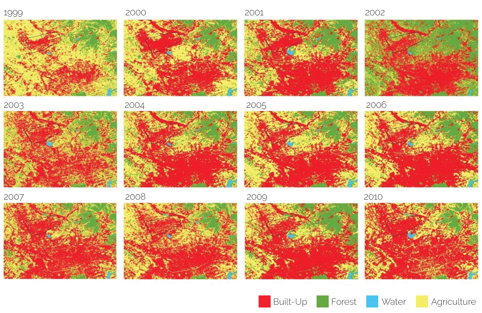
Figure 2.3 shows the land use/land cover maps generated using the support vector machine model for 1999–2010. As these time series maps show, agricultural areas significantly decreased within the study area during this period, whereas built-up areas significantly increased.
Figure 2.3. Bathore Land Use/Land Cover Maps Generated Using the Support Vector Machine Model

Figure 2.3. Bathore Land Use/Land Cover Maps Generated Using the Support Vector Machine Model
Source: Independent Evaluation Group.
Calculating the percentage of the total pixels in each of the images analyzed that were classified into each of the four categories permits us to quantify precisely the visual perception of change. Table 2.2 presents summary statistics for each class and each year. For example, the built-up classification represented 55.92 percent of the area of interest in 1999, but it had increased to 85.86 percent by 2010.
Table 2.2. Summary Statistics for Each Classification Derived with the Land Use/Land Cover Model for Bathore
|
Validation Accuracy (%) |
||||
|
Year |
Built-Up |
Forest |
Water |
Agriculture |
|
1999 |
55.92 |
1.15 |
0.00 |
42.94 |
|
2000 |
84.77 |
0.42 |
0.00 |
14.81 |
|
2001 |
80.42 |
1.38 |
0.00 |
18.21 |
|
2002 |
61.67 |
19.15 |
0.00 |
19.19 |
|
2003 |
74.59 |
1.40 |
0.00 |
24.01 |
|
2004 |
69.40 |
0.57 |
0.00 |
30.03 |
|
2005 |
65.33 |
0.13 |
0.00 |
34.54 |
|
2006 |
66.03 |
0.62 |
0.00 |
33.35 |
|
2007 |
78.68 |
1.05 |
0.00 |
20.27 |
|
2008 |
71.12 |
0.17 |
0.04 |
28.67 |
|
2009 |
68.97 |
2.59 |
0.00 |
28.44 |
|
2010 |
85.86 |
0.04 |
0.02 |
14.08 |
Source: Independent Evaluation Group.
Note: The figures provided in the table offer a depiction of long-term trends. Fluctuations observed from year to year are anticipated and can be attributed to several factors: (i) the small area of analysis, (ii) the relatively coarse spatial resolution of the satellite imagery utilized, and (iii) the heterogeneous nature of the area, particularly evident along urban-rural boundaries or within rapidly developing urban fringes. These combined factors contribute to the occurrence of "mixed pixels”—where individual pixels within the imagery contain a blend of different land cover types—which adds complexity to the analysis..
Of particular interest in this case was the increased urbanization of this area that was observed. As noted in the Project Description section in chapter 1, before the 1990s, the land around Bathore was agricultural and mostly state owned as part of a cooperative. In 1999, the year the project started, the area was still largely used for agricultural activities (42.94 percent, by the model’s classification). As the project aimed at upgrading the area’s urban infrastructure, a transformation in land use (a reduction in agricultural land and an increase in built-up areas) was expected. The presented analysis allowed IEG to corroborate and measure the extent of this transformation.
Advantages
Satellite imagery is an excellent resource for spatial analysis. Among its unique advantages are its high temporal and spatial resolution, long time series (starting from 1972 for Landsat), consistency, global scale, and ease of comparability across countries (Estoque 2020). The use of satellite imagery is typically a cost-efficient alternative to on-the-ground data collection because a substantial portion of optical satellite imagery is publicly available. It is also considerably more time-efficient than data collection on the ground. Furthermore, machine-learning algorithms applied to remote-sensing imagery perform well, are fast, and have a high degree of accuracy.
More specifically for land use/land cover mapping, the methodology presented in this section is very flexible and allows users to customize (i) the number of classes (more or fewer classes can be covered based on the scope of the analysis), (ii) the frequency of the analysis, and (iii) the scale needed for the analysis (global, national, or for any defined area of analysis).
Furthermore, a distinct advantage of the methodology described in this section is that it allowed fairly precise measurement of the phenomenon of urban transformation in the area of interest over time, which is particularly useful for observing temporal changes over the same area. In addition, and as previously noted, given the small surface area of the project, we could not have achieved the same level of granularity in terms of different land uses if we had relied on traditional data sources.
Caveats and Limitations
Although the barriers to entry for using remote-sensing imagery have substantially lowered in recent years, there are still specific technical requirements to consider. Remote-sensing imagery tends to involve large amounts of complex data and requires sufficient storage and computational resources. This includes access to specialized GIS software—such as ArcGIS (proprietary) or QGIS (open-source)—or the use of programming languages (such as Python) or both. In addition, remote-sensing imagery is a very specialized data type; therefore, prior knowledge and expertise are necessary to access, process, and use remote-sensing images for analysis. Furthermore, and depending on the analysis to be performed, knowledge of machine learning might also be needed.
For the mapping of land use/land cover classes, it is essential to select the right level of imagery resolution to enable observation of the details needed for the analysis that is being undertaken. The classification of imagery data into very granular classes might require access to very high-resolution satellite imagery, which can be costly.
An important caveat that also needs to be mentioned is the importance of validating the findings obtained from remote-sensing data. Several alternatives exist for mitigating the biases inherent in digital geospatial data (such as those from instrument calibration, atmospheric effects, topographic effects, noise and artifacts, and seasonal and temporal variability) and ensuring data accuracy. These include cross-referencing the data used for analysis with data from additional authoritative data sources, especially those that are not user generated—for example, ground surveys, census data, and governmental or corporate data sources—(Crampton et al. 2013; Sieber and Haklay 2015) and incorporating qualitative data and local knowledge into the analysis to ensure that the maps that are produced tell a complete story (Esnard 1998). In this case, we validated the findings through (i) comparisons with additional satellite imagery not included in the land use/land cover modeling (specifically, Sentinel images) and (ii) consultations with local GIS experts.
Method 2: Semantic Segmentation of Digital Photos to Derive Fine-Grained Urban Indicators
To gain some understanding regarding the extent to which households in upgraded neighborhoods in the study area were integrated into the formal economy, we derived several urban indicators. For comparison purposes, we derived all indicators for the pilot area, two nearby areas of similar characteristics that were not part of the pilot, and the city of Tirana.
We estimated several indicators (such as density of points of interest, proportion of urban land used, proportion of land covered with buildings, density of transportation facilities, and length of roads) using standard GIS methodologies. We derived two additional indicators—greenness and sky openness—from digital photos. “Greenness” refers not only to the presence of open green spaces (such as parks) but also to the number of trees that line streets and private lawns. There is substantial literature linking a higher level of greenness in a city with improved mental and physical health, increased productivity, and a reduction of carbon footprints (Li et al. 2015; Li and Ratti 2018; Seiferling et al. 2017). “Sky openness” refers to the proportion of the sky that can be seen from a given point (Fang, Liu, and Zhou 2020). In an urban setting, sky openness tends to be linked with building height— as building height increases, sky openness decreases (Xia, Yabuki, and Fukuda 2021).
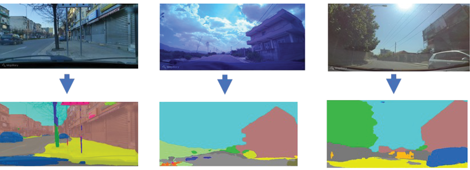
We derived the greenness and sky openness indicators using semantic segmentation, a computer vision technique. Standard GIS methodologies typically work with vector and raster data formats that represent different geographic features and attributes (such as roads, land parcels, and topography information). In contrast, computer vision—a field of artificial intelligence that enables computers to derive information from images and other visual input—primarily deals with image and video data and aims to recognize objects, identify patterns, and extract information from images. Semantic segmentation takes an image as an input and, using an algorithm that groups pixels that have similar visual characteristics, outputs an image in which each pixel has been classified as belonging to one of a group of specific predefined classes. Figure 2.4 illustrates the results of applying the semantic segmentation algorithm to some digital photos of Tirana.
Figure 2.4. Examples of Semantic Segmentation

Figure 2.4. Examples of Semantic Segmentation
Source: Independent Evaluation Group.
Note: The top row of images presents photographs of the city of Tirana extracted from Mapillary, a crowdsourced open platform that allows users to upload geotagged photos. The corresponding images in the bottom row show the output from application of the semantic segmentation algorithm.
As the images in figure 2.4 demonstrate, the semantic segmentation algorithm greatly simplifies the level of detail in input photos. However, this simplification allows various features present in a photo (such as roads, buildings, vegetation, sky, and cars) to be clearly identified as belonging to a particular image class because each feature is colored with a specific shade. These classes can then be used to derive various indicators for further analysis. Although in this particular analysis, we were interested in measurement and in obtaining some descriptive statistics, indicators obtained from semantic segmentation can also be integrated as an input for econometric analyses (see, for example, Suzuki et al. 2023).
Modern semantic segmentation algorithms, such as the one we used for this analysis, are built based on a neural network architecture. Neural networks are a computational paradigm based on interconnected nodes in a layered structure that aims to mimic the way the human brain learns and processes information. For this analysis, we used the PixelLib Python library,5 which implements a semantic segmentation algorithm based on a convolutional neural network—a type of artificial neural network used to analyze imagery—pretrained on the state-of-the art ADE20K data set.6 ADE20K includes more than 27,000 images of urban scenes manually annotated across more than 150 classes.
Data Source: Streetscape Digital Photos
Streetscape images refer to digital photos of urban scenes captured with digital cameras or smartphones. Although the use of streetscape photos for geospatial analysis is less widespread than the use of satellite images, interest in this application of streetscape photos has been steadily increasing (Biljecki and Ito 2021). In addition to estimating greenness (Ki and Lee 2021; Nagata et al. 2020; Suzuki et al. 2023) and sky openness (Liang et al. 2017; Xia, Yabuki, and Fukuda 2021; Zeng et al. 2018), streetscape images have been used in the literature (i) to determine neighborhoods’ socioeconomic attributes by extracting from photos the make, model, and year of vehicles encountered in particular neighborhoods and triangulating this information with data from the census of motor vehicles (Gebru et al. 2017); (ii) to determine building age by extracting features from images of buildings and treating estimation of building age as a regression problem (Li et al. 2018); (iii) to estimate house prices by extracting from exterior images features that relate to the urban environment at both the street and aerial levels (rather than using interior images) and identifying proxies that measure the visual desirability of neighborhoods that can be incorporated into econometric models (Law, Paige, and Russell 2019); (iv) to quantify urban perception by creating a crowdsourced data set containing images of multiple cities and annotations from online volunteers who categorize each photo according to six perceptual attributes (safe, lively, boring, wealthy, depressing, and beautiful) and then using the data set as training data for a convolutional neural network architecture (Dubey et al. 2016); (v) to ascertain cities’ walkability using compositions of segmented streetscape elements (such as buildings and street trees) and a regression-style model to predict street walkability (Nagata et al. 2020); (vi) to assess street quality by combining street view image segmentation to delineate physical characteristics of street networks, using topic modeling with points-of-interest data to extract socioeconomic information and automatic urban function classification (Hu et al. 2020); and (vii) to measure the quality and impact of urban appearance by developing an algorithm that computes the perceived safety of streetscapes and applying this algorithm to create high-resolution “evaluative maps” of perceived safety (Naik, Raskar, and Hidalgo 2016).
Streetscape imagery is ideal for fine-grained spatial data collection. In contrast, satellite imagery (with the exception, perhaps, of very high-resolution data) lacks sufficient detail for this purpose. Therefore, streetscape imagery is ideal for the analysis of small areas.
Furthermore, the use of different computer vision techniques allows processing of a large number of photos in a short amount of time and extraction of their relevant features. These features can then be geocoded, mapped, and used to quantify the urban appearance of an area of interest across multiple dimensions.
A wealth of streetscape photos is publicly available from platforms such as Google Street View and Mapillary.7 Whereas Mapillary is a crowdsourced open platform that allows users to upload geotagged photos, Google Street View relies on Google’s data capture equipment. The latter makes Google Street View’s images more homogeneous. Another consideration is that Google Street View provides stitched panoramas, which might be more suitable for some applications. Coverage varies greatly among different street view imagery providers across the globe; thus, it is generally a good practice to compare coverage across multiple providers to determine which one will provide the most suitable data for a particular application or analysis. Additional data can also be collected easily because only a smartphone is required to capture the required images.
Methodological Considerations
Initial data collection. We extracted streetscape images for each of the areas of interest from Mapillary, which currently offers more than 2.8 billion streetscape images worldwide. Using the precise latitude and longitude coordinates of each image, which are included in the images’ metadata, we plotted the location of each image as a point on a map.
Grid overlay. To ensure that we included in the analysis photos belonging to different parts of each area of analysis, we designed a grid and overlaid it on maps showing the images’ location. The grid was designed to have cells measuring 1 kilometer × 1 kilometer.
Image selection. Because the performance of the segmentation algorithm is sensitive to factors such as seasonal variabilities (especially in connection to the greenness indicator), time-of-day photos were taken, as were field-of-view photos, and a subset of all available images was selected to ensure that the set of photos used in the analysis was reasonably homogeneous.
Complementary data collection. For those cells in the grid for which no images were publicly available, a local consultant took additional photos in the field using a smartphone. In total, more than 1,000 images were selected for the areas of interest (of which approximately 100 were photos taken by the local consultant).
Semantic segmentation. The semantic segmentation algorithm was applied to all selected images.
Calculation of pixel ratio. An image’s greenness ratio can be defined as the total number of green pixels in the image divided by the total number of pixels. Similarly, an image’s sky openness ratio can be estimated as the number of blue pixels in the image divided by the total number of pixels.
Mapping. Given that we knew the precise geographic coordinates for each photo for which the greenness and sky openness ratios were calculated, we were able to visually represent these indicators in a map. To obtain a continuous representation, we estimated ratio values for the areas between the images’ locations by applying an inverse distance weighting interpolation algorithm. This algorithm approximates unknown values by averaging the values of nearby points based on a distance metric, assigning a higher weight to the values for those points closest to the unknown point. Figure 2.5 presents the maps we generated of the greenness and sky openness indicators for the city of Tirana.
Figure 2.5. Greenness and Sky Openness for the City of Tirana

Figure 2.5. Greenness and Sky Openness for the City of Tirana
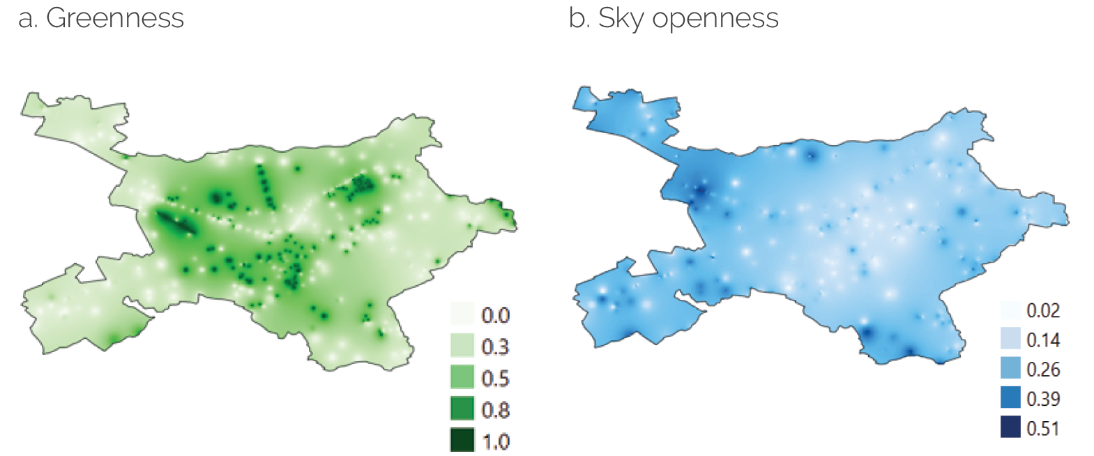
Source: Independent Evaluation Group.
Note: Panel a maps the greenness indicator values, and panel b maps the sky openness indicator values.
Robustness checks. To test the robustness of our indicators, we performed two tests: (i) for the greenness indicator, we compared the map derived from the images with OpenStreetMap data showing the presence of parks and other open green areas, and (ii) for both indicators, local consultants conducted on-the-ground validity checks for selected areas.
Main Findings
The combination of multiple data sources and methodologies allowed us to derive fine-grained urban indicators, which offer a more nuanced and detailed view of urban development than traditional metrics and can be instrumental in better assessing the social and economic impact of urban development interventions. Furthermore, and as illustrated in figure 2.6 (summarizing the indicators derived for the areas of interest), this methodology also allowed us to compare several areas of interest to determine their level of urbanization across the same dimensions.
Figure 2.6. Urban Indicators for Areas of Interest

Figure 2.6. Urban Indicators for Areas of Interest
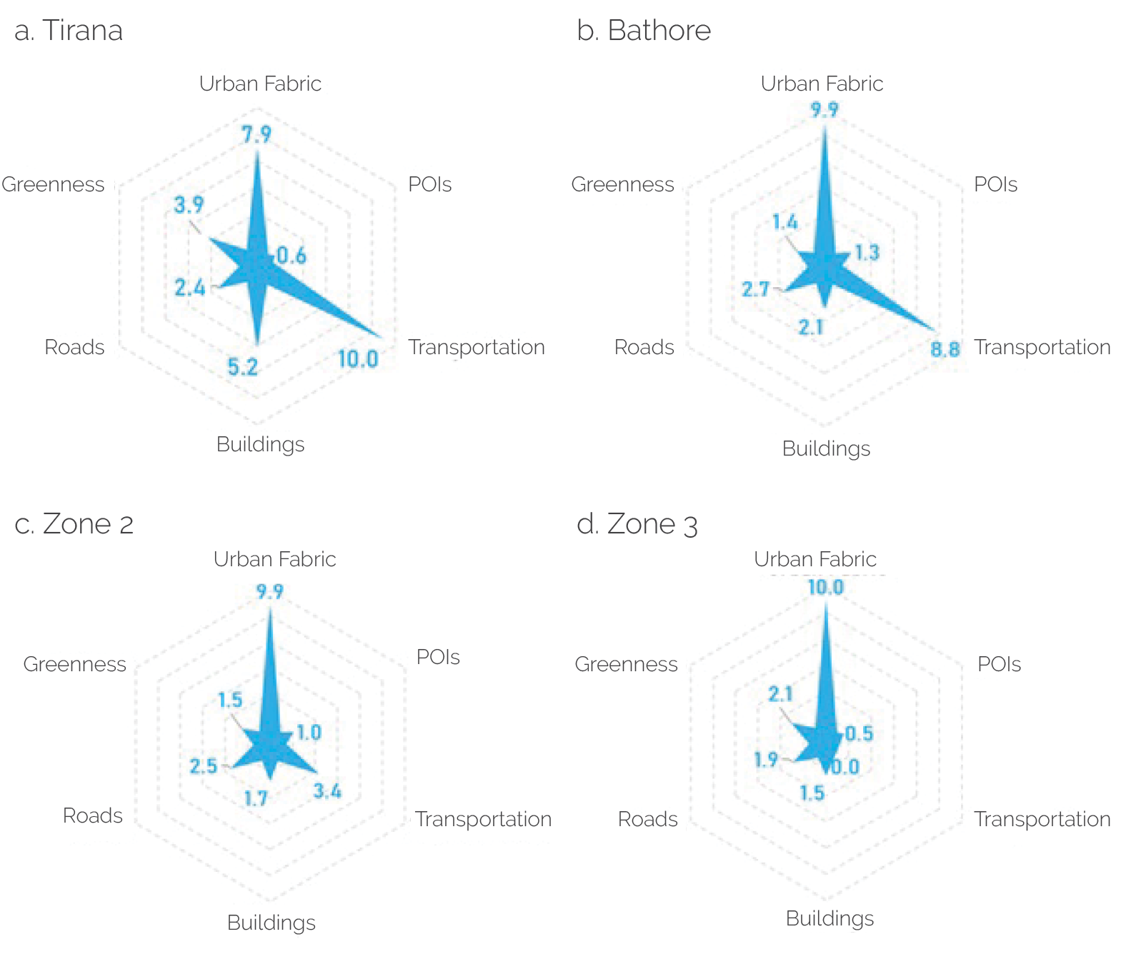
Source: Independent Evaluation Group.
Note: The figure presents values derived for urban indicators for the pilot area (Bathore), for two additional areas with characteristics similar to those of Bathore (zones 2 and 3), and for the city of Tirana. POI = point of interest.
Advantages
Gathering fine-grained urban data is typically a time-consuming and costly exercise that requires extensive field visits and the development and application of clear data collection protocols. The pairing of streetscape photos and computer vision algorithms opens up many innovative opportunities for detailed and rigorous analyses of urban phenomena.
Notable advantages of streetscape imagery are its ease of access and global coverage. Goel et al. (2018) estimated that publicly available streetscape imagery covered half of the world’s population at the time of their research, and it seems reasonable to assume that this figure has substantially increased since then. Furthermore, and unlike with satellite imagery, streetscape images in addition to those available through public data platforms are easy to capture with any device (such as a smartphone) capable of taking digital photos.
Most important, access to a global data set creates promising prospects for deriving standardized indicators of urban development and conducting comparative studies for different cities across the globe. This is extremely challenging when relying exclusively on traditional data sources (such as cadastral data or land use surveys), which are typically collected at the municipality level (Prakash et al. 2020).
Caveats and Limitations
Even though streetscape imagery is on the path to achieving global coverage, crowdsourced street-level imagery faces some limitations to achieving full coverage. These include logistic difficulties, legal restrictions on capturing images of certain areas, and safety considerations (Quinn and León 2019). For example, a study of street-level coverage of images in Brazil found low coverage at both ends of the socioeconomic spectrum. Although lower-income areas remained undermapped because lack of roads makes access difficult, more affluent neighborhoods were undermapped because of the presence of gated communities where street-level photos cannot be taken (Quinn and León 2019). Generally speaking, the undermapping of certain areas is an important consideration that needs to be assessed before proceeding with a specific analysis because it could introduce biases into the data used for the analysis and lead to an inadequate understanding of the local context. The undermapping of poor areas is particularly concerning in the context of the evaluation of development interventions; this issue can directly affect poverty estimates derived from imagery data and lead to inadequate targeting efforts, which might result in key intended beneficiaries being missed.
Temporal considerations impose more substantial limitations because streetscape data were not collected in the past. The lack of past data severely restricts researchers’ ability to create time series of streetscape data to conduct longitudinal studies. This limitation, however, is expected to diminish over time as new data are collected.
In addition, computer vision algorithms are computationally intensive and require large volumes of data to identify patterns in the data. Therefore, the use of this type of algorithm is most suitable for studies involving small areas. Nevertheless, as computational resources increase and algorithms become more efficient at optimizing computations, these applications could be feasible for use in regard to larger areas (Ki and Lee 2021).
The use of computer vision algorithms—especially neural networks—presents some additional challenges in regard to transparency and interpretability of results. Many of these algorithms are opaque in the sense that the mathematical operations and transformations performed on the data might not be fully traceable, rendering the algorithms virtual black boxes.
Finally, from a more practical perspective, in addition to the computational resources needed to store and process the images, working effectively with computer vision algorithms requires prior knowledge of machine learning and image processing and analysis. The application of most computer vision algorithms requires familiarity with programming languages, such as Python, including specialized libraries for computer vision tasks.
- Machine learning, a subset of artificial intelligence, encompasses a set of algorithms that can automatically learn from data without being explicitly programmed.
- For more information on the moderate-resolution imaging spectroradiometer, see the National Aeronautics and Space Administration website at https://modis.gsfc.nasa.gov/data/ dataprod/mod12.php; for more information on MCD12Q1, see the United States Geological Survey website at https://lpdaac.usgs.gov/products/mcd12q1v006.
- The electromagnetic spectrum comprises seven bands: gamma rays, X-rays, ultraviolet, visible, infrared, microwaves, and radio waves. Most optical satellite images are captured in the visible and infrared parts of the spectrum. Other remote-sensing images are captured in other parts of the spectrum (for example, radar imagery is captured in the microwave band).
- For more information on Landsat 7, see the United States Geological Survey website at https://www.usgs.gov/landsat-missions/landsat-7.
- For more information on PixelLib, see https://Pixellib.readthedocs.io/en/latest.
- For more information on the ADE20K data set, see the Massachusetts Institute of Technology Computer Science & Artificial Intelligence Laboratory Computer Vision Group website at https://groups.csail.mit.edu/vision/datasets/ADE20K.
- For more information on Google Street View and Mapillary, see https://www.google.com/ streetview and https://www.mapillary.com, respectively.